- Title: Principles of High-Dimensional Data Visualization in Astronomy
- Authors: Alyssa A. Goodman
- First author’s institution: Harvard-Smithsonian Center for Astrophysics, Cambridge, MA, USA
The Challenges of Working with Multidimensional Data
Assuming that your observing proposals are approved and that you are lucky enough to have clear skies during your scheduled telescope time, your next big challenge comes after you leave the telescope. One of the primary challenges facing astronomers is how to view and interpret data. Astronomers often collect data across many dimensions and it’s challenging (if not impossible) to visualize multiple dimensions simultaneously. For instance, imagine that you’ve used an integral field unit to take spectra at multiple positions within a galaxy. You would then have a data cube consisting of a stack of 2-dimensional images of the galaxy in position space (i.e., right ascension versus declination) at each wavelength. As shown in the figure below, you could display this data as 2-D images at each wavelength or you could choose to plot the spectrum of the galaxy at each position.
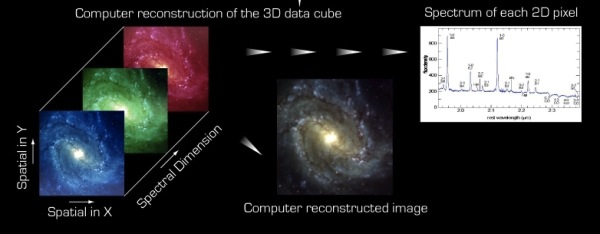
A 3D data cube displayed as 2D slices at each wavelength, a spectrum of the flux at a single pixel, and a 3-color composite image. Copyright ESO.
Decomposing the data cube into 2-dimensional plots and spectra is a convenient way to examine the data, but what would we do if we wanted to analyze data with even more dimensions? For example, how would we display the data if we also had information about the velocities of stars within the galaxy, the temperature of the gas, or the distribution of dark matter? Would we have to produce separate 2-dimensional plots of each combination of parameters or could we analyze the data in a more coherent fashion?
Current space missions and ground-based surveys are returning more data than ever before, so astronomers are actively thinking about questions like these. Astronomers are eager to learn how to sort through large data sets quickly and extract as much information as possible from their data. Several researchers are working to develop sophisticated, multidimensional data visualization techniques to highlight correlations and patterns within the data that would likely remain hidden if the data were examined using only traditional approaches.
The Paper
In this paper, Professor Goodman reviews the history of multidimensional data analysis techniques and outlines a vision for how astronomers will interact with data in the near future. She explains that the three guiding principles of any multidimensional data analysis are data, dimensions, and display. As you would expect, “data” refers to the information being analyzed and the “dimensions” are the different facets of the data (e.g., right ascension, declination, and wavelength in our example above). The final D-word, display, is how the author decides to present the data. Display is about more than color schemes and font choices. Scientists need to think carefully about which dimensions should be plotted and how the graph should be annotated. While an author might be tempted to include as much information as possible on the graph, that information quickly loses value if the reader is overwhelmed by the plot. The figure below shows an example of a plot made with careful attention to the three D’s.
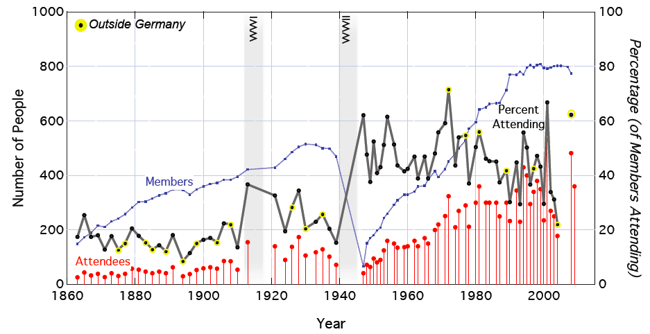
Attendence at the Astronomische Gesellschaft meetings from 1860 until today. Figure 1 from Goodman 2012.
In the example figure, Professor Goodman has presented several pieces of data from the historical archives of the Astronomische Gesellschaft (AG). She started with a table containing 8 columns of data: the years of AG meetings, the meeting number, the meeting location, the meeting date, the number of AG members, the number of meeting attendees, the number of talks, and the number of posters. Rather than reprint the numbers in a table that would likely be skipped over by readers, Professor Goodman distilled the 8-dimensional data set into a single chart showing the meeting attendance over the past 150 years. The number of AG members during each year is indicated by the blue line and the number of meeting attendees is shown by the red points. The percentage of members attending each meeting is shown by the black line, which uses the y-axis on the right side of the graph. Several of the black points are highlighted in yellow, indicating that those meetings were held outside Germany. There is a gap in the meeting series during the two World Wars, so Professor Goodman marked WWI and WWII on the chart so that readers would quickly understand the breaks in the meeting series.
Applying the 3 D’s to Astronomy
Although the data plotted in the example figure is not very astronomical, the principles behind the creation of the figure can be applied to plots of astronomical data. Scientists can expand a traditional 2-dimensional x-y plot to include data from higher dimensions by adding additional axes and using different symbols and colors for some data points. They can also add context data (like the timing of the World Wars in the example) by shading the plot background or highlighting certain points. These tricks greatly expand the amount of information that can be depicted on a flat 2-dimensional plot, but the plot is still static.
Dynamic Plotting Tools
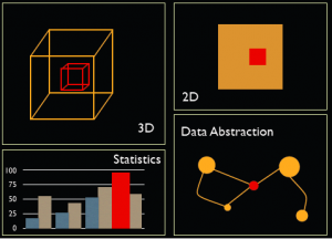
A schematic representation of a linked view environment in which a user could select a region in one panel and the region would be automatically highlighted in all of the other panels. Figure 2 from Goodman 2012 (created by M. Borkin).
The next step in working with multidimensional data sets is to switch to a platform that allows a user to interact with multiple dimensions of data simultaneously. These systems are often called “Linked View” platforms because they consist of multiple linked windows. As sketched in the figure at right, a user could select a region in a 2-dimensional image using the mouse and then see what that data subset looks like in other dimensions. Most early versions of linked view platforms did not allow users to draw their own irregular selection regions, so astronomers could not easily examine arbitrary subsets of data. Thanks to the dedication of astronomers like Professor Goodman, the situation is changing and there are now a few options for astronomers who would like to interact closely with multidimensional data.
For instance, graduate student Christopher Beaumont has written an IDL program called Dendroviz to allow astronomers to visualize the multidimensional structure of molecular clouds. There’s a neat video of Dendroviz in action here.
The International Virtual Observatory Community has also been breaking ground with a program called SAMP that establishes communication channels between different astronomical tools. A user running SAMP could open up an image in the Aladin Sky Atlas and plot data from several different astronomical catalogs. The user could then start WorldWide Telescope and use SAMP to “steer” the WorldWide Telescope field of view to match the field of view shown in Aladin. The user could also select objects from certain catalogs in Aladin (i.e., all young stars imaged by the Spitzer Space Telescope) and then see those objects highlighted in the corresponding WorldWide Telescope view.
The Future of Multidimensional Data Analysis
Professor Goodman ends the paper with an exciting glimpse of how researchers might interact with data in 5–15 years. She is currently working with several other researchers to develop a python-based platform called “Glue.” As the name suggests, Glue effectively glues together bits of code from various python modules to create a highly customizable linked-view visualization environment. Professor Goodman is also working with medical researchers to bring the high-level visualizations used in the medical world to astronomy.
In the future, researchers will use tools like medical visualizations and interfaces like Glue to interact seamlessly with data. Like today’s scientists, a researcher might start the day by reading a journal article posted on astro-ph. The researcher could spot an interesting image of a nebula in the paper and use WorldWide Telescope to see what surrounds the nebula and how the nebula appears at other wavelengths. The researcher could then open Glue and SAMP to query the archive of astronomical papers and determine if other researchers have shared data about the nebula or the surrounding region. If the researcher finds other interesting bits of data, she or he could then use the linked-view visualization built-in to Glue to analyze multiple dimensions of the data simultaneously.
A quick view might reveal a few interesting correlations between the data set, so the researcher could dive into work on a new paper. Along the way, she or he might write some new code and upload it to the online Glue repositories to share with other researchers after submitting the paper to a journal. The paper will likely include three-dimensional figures and linked data cubes so that other researchers can be similarly inspired by the new paper. The research world of the future might seem distant, but many of these tools are already available and platforms like Glue might be automatically installed on university computers before most of the current astrobites authors earn doctorates.

Trackbacks/Pingbacks