Title: Morphology and the Color-Mass Diagram as Clues to Galaxy Evolution at z~1
Authors: Meredith C. Powell, C. Megan Urry, Carolin N. Cardamone, et al.
First Author’s Institution: Yale Center for Astronomy and Astrophysics, and Physics Department, Yale University
Status: Published in The Astrophysical Journal, open access
Introduction
In astronomy, the relationship between the color and the brightness of objects has been used as a basic classification tool for decades. For stars, color is a measure of temperature; the bluer a star, the hotter it is. Measuring the relationship between observed colors and brightnesses of stars helps astronomers figure out the evolutionary sequences of stars.
It turns out that you can do almost the exact same thing for galaxies. Except this time, the color of a galaxy is a measure of how quickly it produces stars, called its star formation rate. This is because hot (and therefore blue) stars are extremely bright, despite being relatively rare, so they can make a whole galaxy appear blue. And such hot stars don’t live for long, so if a galaxy has these stars it must have formed them very recently. On the other hand, the brightness of a galaxy is roughly correlated with its mass, since a more massive galaxy will generally have more stars and therefore be brighter than a less-massive galaxy.
The color-mass diagram
In the same way we use color-magnitude diagrams to determine how stars evolve, we can use a plot of galaxy color (star formation rate) against mass (brightness) to figure out how galaxies evolve.
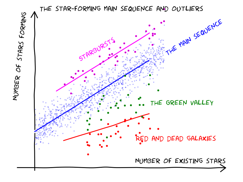
Figure 1. A cartoon of a low-redshift color-mass diagram. On the y-axis, “number of stars forming” is the star formation rate, which is correlated with color; on the x-axis, “number of existing stars” is the mass, which is correlated with brightness. (Source)
Figure 1 (which is a cartoon that I’ve shamelessly borrowed from this previous Astrobite) shows a few basic trends that emerge from this color-mass plot. There’s a “main sequence” of blue star-forming galaxies, where most galaxies lie. It’s thought that galaxies move from this main sequence to the “red and dead cloud,” made up of red galaxies that aren’t actively forming many stars. Not many galaxies are located in the region between these two areas, sometimes called the “green valley,” suggesting that galaxies don’t stay there for a very long time—so the processes that “quench” (turn off) star formation in blue galaxies must be relatively fast.
These basic trends appear on the color-mass diagram in the nearby universe at z~0 (z is what astronomers call “redshift,” which is both a measure of distance and of the universe’s age). Today’s paper aims to understand the trends on the color-mass diagram at higher redshifts (z~1), when the universe was younger—less than half its current age!
Today’s paper
More specifically, the authors want to answer a few questions:
- Do overall trends in the color-mass diagram look different at high-redshift (z~1) than at low-redshift (z~0)?
- Do elliptical (what the authors call “bulge-shaped”) and spiral (“disk-shaped”) galaxies follow the same trends on the color-mass diagram?
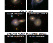
If the answer to question (1) is “yes,” then we know that the processes that shut off star formation have changed from redshift z~1 to now. And because most bulge-shaped galaxies are thought to be the results of galaxy mergers (although this is up for some debate), answering question (2) would help us figure out how mergers affect galaxy evolution.
To address these questions, the authors first used Hubble Space Telescope images (specifically, the GOODS and CANDELS surveys) to measure the colors of about 5000 galaxies. Next, they matched the galaxy spectral energy distributions to theoretical models in order to infer their masses. Finally, they fit the galaxy images to different profile shapes to distinguish between “bulge” and “disk” galaxies.
Armed with this data, let’s see if the questions above were answered.
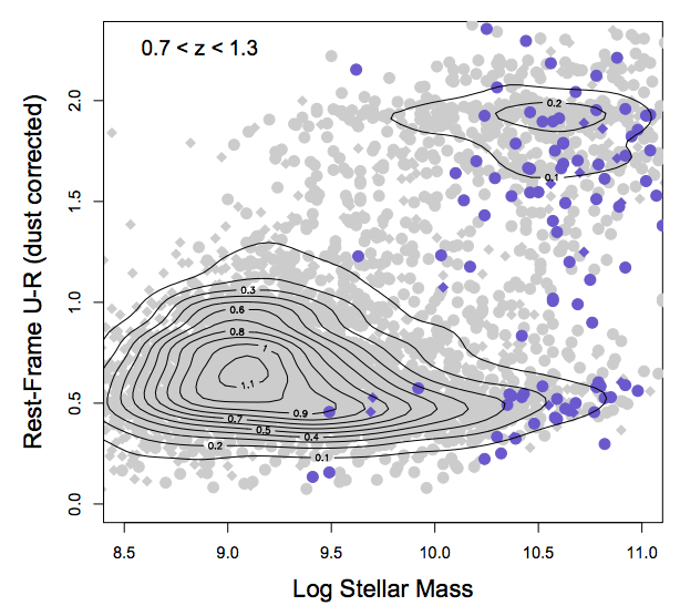
Figure 2. The color-mass diagram at z~1. Note that the y-axis is reversed from Figure 1, so that bluer (higher SFR) galaxies are lower and redder galaxies are higher. This means that the “main sequence” is marked by the contours in the bottom left, while the “red and dead cloud” is marked by the contours in the upper right. Purple points are active galactic nuclei (AGNs). From Figure 2 of the paper.
- Do overall color-mass trends change with redshift?
Figure 2 shows the color-mass diagram at z~1. Like Figure 1 (which is a cartoon of the z~0 color-mass diagram), it shows that the “main sequence” and “red and dead cloud” are mostly distinct. The main difference is that there are fewer “red and dead” galaxies than at z~0. This is probably because there hasn’t been as much time since the peak of star formation in the universe (which was at redshifts z~1-3) for galaxies to move away from the main sequence.
- Do bulges and disks follow the same color-mass trends?
Disk galaxies follow pretty much the same trend as the gray points in Figure 2, although the “main sequence” and “red and dead cloud” are not as distinct. In contrast, bulge galaxies (see Figure 3) are mostly clustered in the “red and dead cloud,” with very few galaxies between the cloud and the “main sequence.” This means that disks probably evolve gradually, but bulge galaxies (which are the results of mergers) undergo a much more abrupt quenching process. (Note that this agrees with the results reported in this Astrobite for low redshifts!)
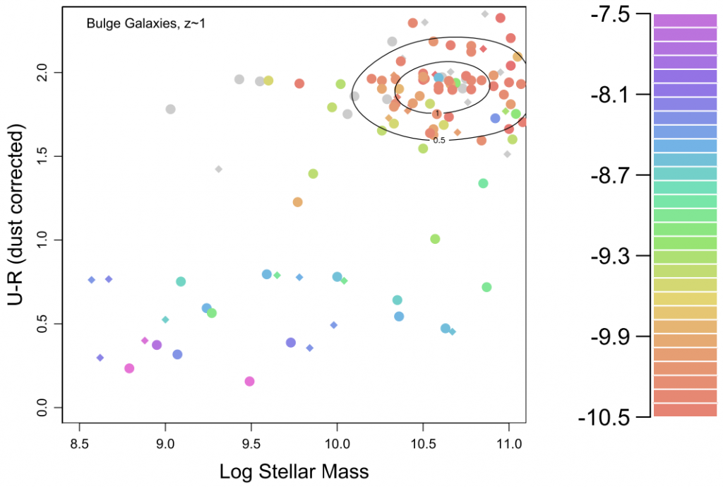
Figure 3. Color-mass diagrams for bulge galaxies. The galaxies are colored by specific star formation rate, which is just star formation rate divided by mass.
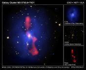
So we’ve answered all our questions! But the authors note that there are still some unclear results. For instance, they also compare the color-mass trends of active galactic nuclei (AGNs; the purple points in Figure 2) with the trends of inactive galaxies. This is an important question in galaxy evolution, since it’s not clear whether feedback from AGNs helps to trigger or quench star formation. The authors find that AGNs might have some effect on quenching, particularly in mergers, but more data is needed to be certain.
The color-mass diagram has been around for a while—but as today’s paper shows, it’s still an incredibly useful diagnostic tool that can teach us a thing or two about galaxy evolution.

NIcely done. You have a gift for real communication rather than showing off.