Astrophysics is hard. If you’re in the field, chances are that you have trained for years upon years to understand the intricacies of a very narrow range of astrophysical phenomena; if you’re not an expert, academic papers can be scary, overwhelming, and often all-too-dry. Because of this barrier to entry, it can be hard to keep on top of the current research (or even seminal papers of years past). But what if there was a more accessible way of reading papers? A way that assumes essentially no background in the field? Enter: the ‘doodle summary’.
The doodle summary, or annotated paper, is a concept introduced by Claire Lamman, originally as a way to describe the complicated methodology and results of her scientific article to her mother. To make such a summary, Claire annotated and drew directly over her paper in an informal way that communicated the science in clear, (mostly) everyday language as in Figure 1. All that the reader needs is to match the enthusiasm of the author, and to commit ~15 minutes of their time.

Figure 1: The first two pages of one of Claire’s first annotated summaries. Illustrations litter the paper’s margins, and the annotated text is overlaid directly over the desaturated paper content; essentially the same scientific content is conveyed, but in a more accessible format.
Similar in scope to an astrobite, the goal of a doodle summary is to communicate not only the results and conclusions of a paper, but the methods too. In contrast, news outlets will typically report on only the results of the flashiest papers which can skew the public perception of how science is done. With an annotated paper, the scientific content of the paper remains more-or-less intact, showing the journey to the result which can bolster trust in the science and communicate that science is a steady stream of incremental improvements in our understanding.
There are many reasons to annotate your own papers, and not just for the benefit of others. Writing these summaries is an invaluable way of training your brain to communicate hard science with a general audience. The paper summaries are not only appreciated by the public but by your scientific peers too, and they help to advertise your science to astronomers in other niches who mightn’t have otherwise read the paper.
A Beginner’s Guide to Annotating a Paper
Just like starting to write a paper, it can be daunting thinking of where to start annotating one. Many people have had success annotating papers in Powerpoint (Google Slides is a free alternative), starting with a .pdf file of the paper. To really make the annotations pop, desaturating the underlying paper .pdf is a good move. The next step is to decide on an annotation font – handwriting can be inconsistent and messy – that is casual but importantly legible, and a broad colour scheme. For the former, the xkcd script is a favourite in the field, and fonts such as Comic Sans are especially helpful for readers with dyslexia. As for the latter, a muted colour (such as deep blue/purple/red) is good and can be distinguished easily from the grey text in the underlying .pdf.
When annotating the paper itself, it can be easy to forget how deep into the field you are. As a starting point, assuming that the audience knows very little about the field is a safe bet – see this astrobite for broad tips on science communication. With that in mind, avoid overly technical language and introduce everything in broad terms. Of course, there will be some cases where jargon must be used, but this should be clearly defined and used sparingly. The reader doesn’t need to understand every method in the paper, just enough to follow the overarching flow and to appreciate the significance of the results. As with any writing, it is important here to consistently link back to the big picture (why are we doing this, anyway?) with the methods and results.
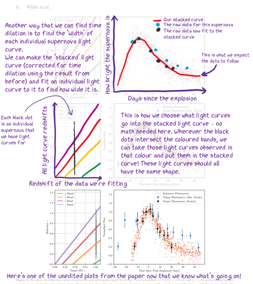
Figure 2: A cropped page from one of my annotated summaries showing one example of how to explain plots to a general reader. The original paper had three rows of similar plots, so I used the first two rows to explain the plot structure, and the final row was included unedited.
The conventions of any field can be hard to follow for non-experts, and astronomy is no exception. Where appropriate, it can be useful to forgo some scientific plots entirely within the annotated summaries and instead substitute them with illustrations and diagrams. Despite this, some plots are essential to the flow or conclusions of the paper and must be included, just make sure to walk the reader through how to interpret the plot both in terms of its presentation and the message it’s trying to convey (see Figure 2).
Last but not least, the proverbial elephant in the room: the illustrations for our annotated paper. While some artistic background may ease the workload in annotating a paper, it is by no means essential. The charm of well-presented stick figures (see the success of Randall Munroe’s xkcd comic) can keep the reader interested in your many-page paper. Digital drawing is made easy with tools such as Paint.Net or Powerpoint/OneNote, which can be transferred to your paper. Where precision is needed, making vector graphics (e.g. with InkScape) is great path to presentable illustrations and there is even aa matplotlib xkcd drawing mode to quickly make charming and casual plots.
Aside from the linked papers above, there is a compiled list of annotated summaries made by others available here. If you make your own, why not host it on your own website? As scientists, we put so much effort into our science and communicating our results to our peers, but communicating to the public is just as important (the taxpayer usually does fund our science after all). The doodle summary is quickly becoming a popular and effective tool of communicating science, and I hope you all consider writing your own!
Astrobite edited by Kylee Carden
Featured image credit: Claire Lamman