Almost everyone interested in science will come across plots. In astronomy and astrophysics, though, plots can look a little different. Unfamiliar axes, unusual units and features can make them feel harder to read at first glance.
In this Astrobite, we’ll walk through some of the common features you’ll see in astronomy plots – whether in papers, news articles, or other Astrobites – and help you make sense of them.
You might have heard the joke that astronomers invent new units just to confuse everyone else. While we won’t get into that debate here, these choices aren’t arbitrary. They’re driven by two key challenges: the enormous range of values we deal with, and the need to show how confident we are in what we’re seeing. Together, these shape the way astronomical data is presented, and once you know what to look for, those “weird” plots start to make a lot more sense.
Ways We Tackle Range – The Logarithmic Scale
In everyday life, we usually think in terms of linear scales. For example, if you have a ruler, each centimetre represents the same fixed length. On a linear plot, each step along an axis represents the same increase in the quantity you’re measuring.
But in astronomy, many quantities don’t play nicely with linear scales. Stars can vary in brightness by a factor of a million or more. Galaxies can have masses that differ by billions of times. Plotting these on a standard linear scale would either squash the smaller numbers into invisibility or blow up the big numbers off the chart.
This is where a logarithmic (log) scale comes in. A log scale doesn’t increase in equal steps of the quantity itself; it increases in equal steps of the logarithm of the quantity. In simpler terms, each tick mark on a log axis might represent 10×, 100×, 1000×, etc., rather than +1, +2, +3, etc.
Using a log scale has a few big advantages:
- Compression: Huge ranges become readable, so you can show both dwarf stars and massive stars on the same axis.
- Pattern recognition: Many astrophysical processes follow power laws (e.g., brightness ∝ mass³), which appear as straight lines on log-log plots, making trends easier to see.
- Multiplicative differences: A doubling or tenfold increase is represented by the same physical distance on the axis, making comparisons intuitive.
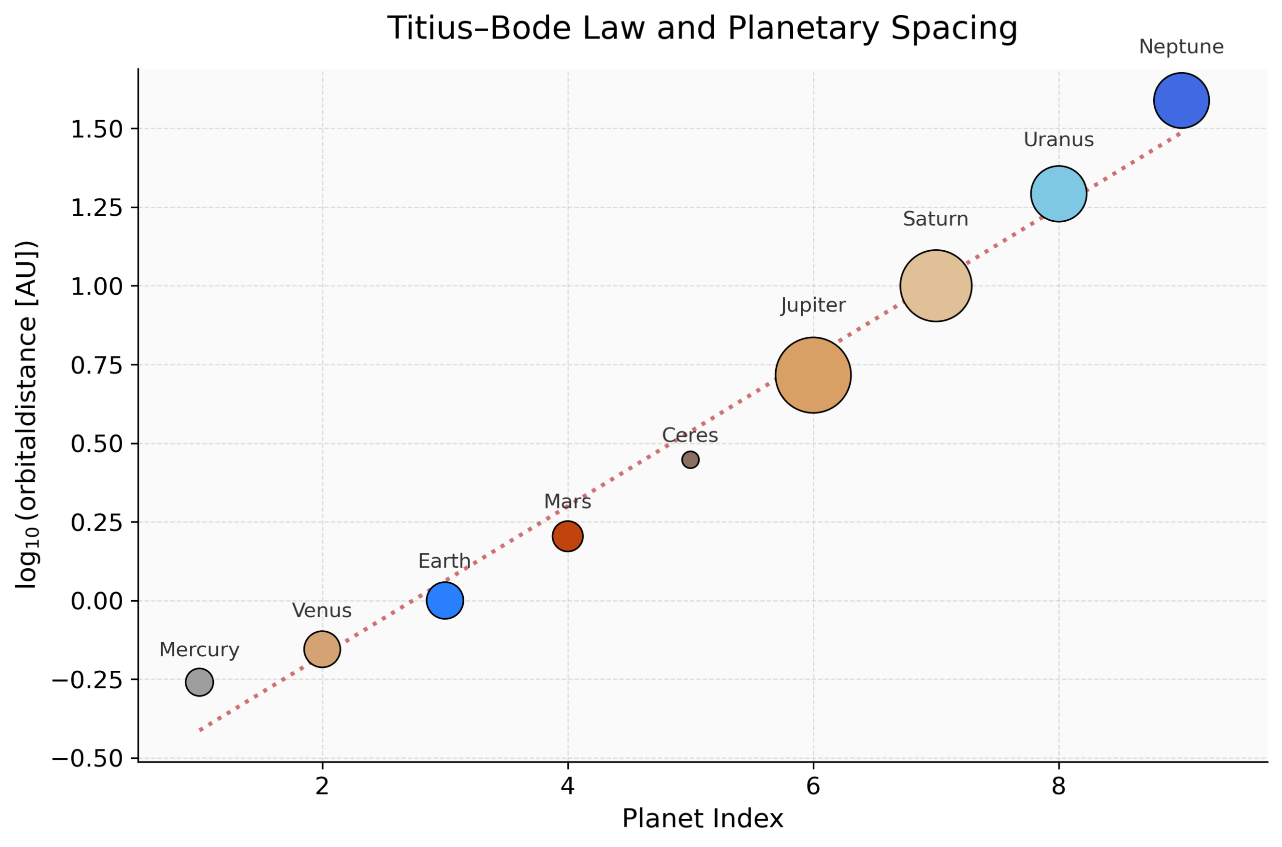
You can see an example of a log scale in action in Figure 1, which shows a Titius–Bode plot of planetary semi-major axes. Notice how the distances between planets are more visually comparable when plotted in log scale, even though the actual orbital radii span a huge range.
Ways We Tackle Range – Dex
In astronomy, you’ll often see quantities expressed in dex, which is short for “decimal exponent.” One dex is a factor of ten. When a paper says something increases by 0.3 dex, that’s the same as multiplying by 100.3, which is approximately 2.
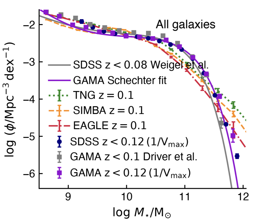
Dex is closely tied to log scales because a value in dex is essentially the logarithm (base 10) of a physical quantity. The units dex⁻¹ often appear when plotting something like a mass function, like in Figure 2, where we describe the number of objects per unit dex. This is just like saying how many stars exist in each factor-of-ten bin of mass.
Ways We Tackle Range – Comparative Units
In addition to log and dex scales, astronomers often use comparative units to make extremely large or small quantities easier to understand. These units express a value relative to something familiar in astronomy or Earth-based measurements.
Examples from the last two plots:
- AU (Astronomical Unit): One AU is the average distance from the Earth to the Sun (approximately 1.5×10 metres). In the Titius–Bode plot (Figure 1), planetary distances are expressed in AU, which makes the relative spacing of planets intuitive without dealing with billions of kilometers.
- M⊙ (Solar Mass): One solar mass is the mass of our Sun (approximately 2×10 kg). Stellar masses in the stellar mass function plot (Figure 2) are measured in M⊙, so a star with 10M⊙ is ten times heavier than the Sun or 1 dex heavier. Using M⊙ avoids writing out enormous numbers in kilograms and immediately gives a physical reference.
By combining comparative units with log or dex scales, astronomers can plot data spanning huge ranges in a way that is readable, intuitive, and physically meaningful.
Ways We Tackle Probability – Contours
Astronomy isn’t just about collecting big numbers. It’s about dealing with uncertainty. Every measurement comes with its own quirks: the telescope might blur your view, the detector might miss photons, calculations to infer mass or brightness introduce assumptions, and even the universe itself adds a bit of randomness. To make sense of all this, astronomers often rely on probability-based visualizations to communicate how confident we are in our results.
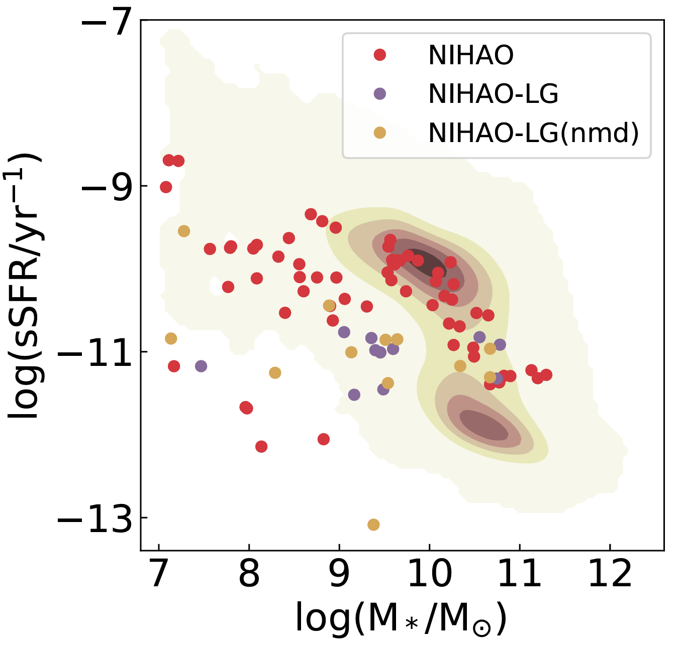
Contours are a powerful way to show where data points are concentrated in a plot. Contours draw lines around regions of high density, much like a topographic map shows elevation. In Figure 3 you can see contours used to express dense regions of real observational data. Contours don’t show “probability” in a strict sense, but they reveal where data points are most common.
Ways We Tackle Probability – Confidence
Confidence regions are like the professional cousin of contours. You’ll usually see them in models or simulations, where the goal is to estimate an underlying relationship, not just plot raw data. A confidence region shows the range where the true value is likely to lie with a given probability: often 68%, 95%, or 99%.
You can see this clearly in Figure 4. On the left, we have radial velocity data with error bars and a best-fit model. This model depends on two parameters: the orbital period (P) and the velocity amplitude (K). The right-hand panel shows what happens when we ask: “Given the data, what combinations of P and K are actually consistent with what we observed?”
Instead of a single answer, we get regions:
- The inner contour (68%) shows the combinations that best match the data – this is where the answer is most likely to lie.
- The middle contour (95%) includes a wider range of possibilities that still agree with the data, but not quite as strongly.
- The outer contour (99%) shows almost all combinations that are still plausible, including those that are much less likely.
In other words, the closer you are to the centre, the better the match to the data. While the outer regions include more possibilities, they have weaker support.
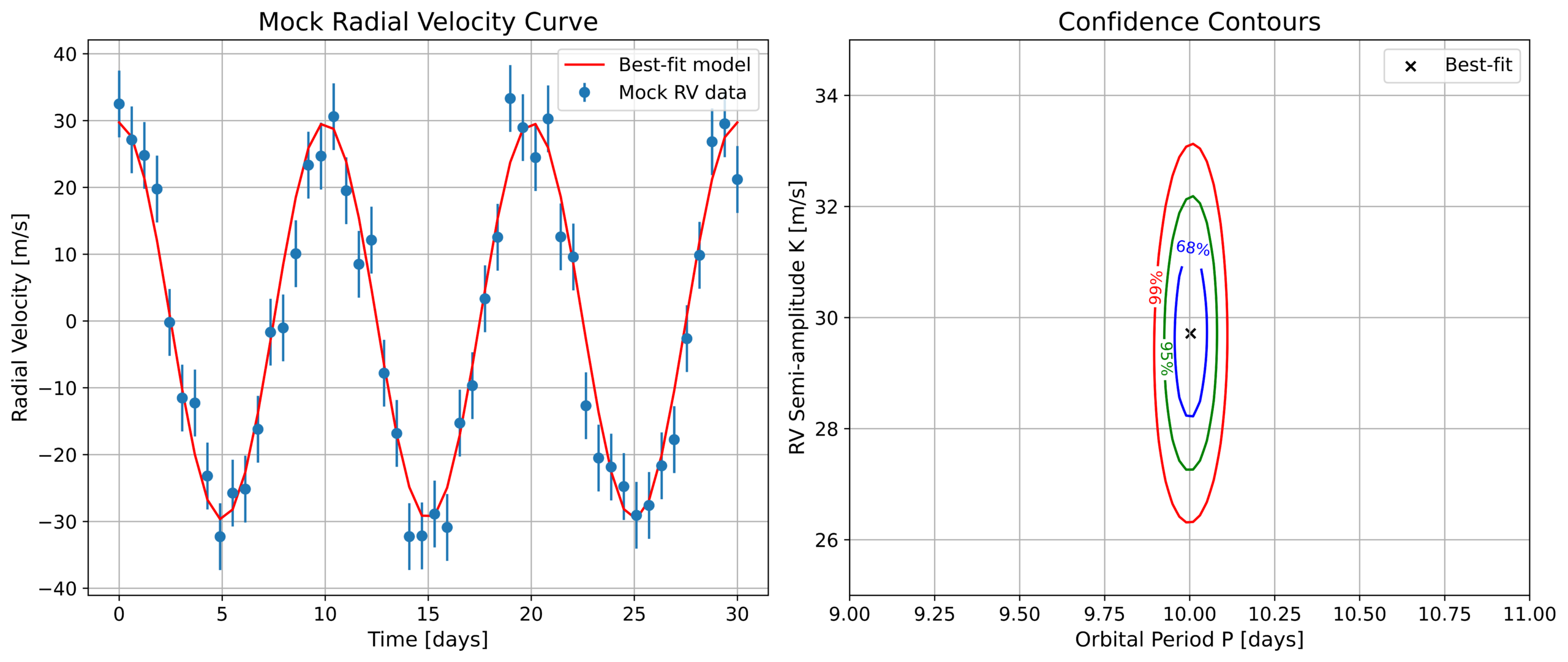
The black “×” marks the best-fit solution, but the key point is that it’s not the only possible answer. The elongated shape of the contours tells us that the parameters are correlated (especially if the tilt of the contours are more dramatic): for example, a slightly longer orbital period can be compensated by a different velocity amplitude and still fit the data well. The scatter in the data points and their error bars (left panel) directly translate into the size and shape of the contours (right panel). If the data were more precise (smaller error bars), the contours would shrink. If the data were noisier, the contours would expand. If the uncertainties in the parameters were independent, the contours would be aligned with the axes. So while the left plot shows uncertainty in the data, the right plot shows uncertainty in the model parameters inferred from that data.
Wrapping Up
Astronomy plots can look intimidating at first glance, but once you understand the logic behind them, they quickly become surprisingly intuitive. This isn’t an exhaustive guide to every plotting quirk you might encounter, but it should give you the tools to make sense of new quirks when they appear.
If you’re curious, I’ve put together a Python Jupyter Notebook where you can play around with these kinds of plots: tweak parameters, change uncertainties, and watch how the contours and distributions respond in real time.
Check it out here: Plotting Tutorial Playground
Feel free to comment about any other wacky plot features you have encountered!
Astrobite edited by Laurie Amen
Featured image credit: Jayde Willingham (Image from Luis Felipe Alburquerque and Cartoons from Veii Rehanne Martinez
Good to see the Titus-Bode curve. Classic plot!
Thanks for reading!