Title: Fundamental limitations of high contrast imaging set by small sample statistics
Authors: D. Mawet, J. Milli, Z. Wahhaj, D. Pelat, et al.
First Author’s Institution: European Southern Observatory
Status: Published in ApJ [open access]
Introduction
The world’s state-of-the-art exoplanet imaging projects include the VLT’s SPHERE, Gemini’s GPI, Subaru’s SCExAO, Palomar’s Project 1640, and the LBT’s LEECH survey. As next-generation imagers come online, we need to think carefully about what the data say as sensitivities push closer in to the host stars. This Astrobite is the first of two which look at papers that change the way we think about exoplanet imaging data.
Traditionally, high-contrast imaging programs calculate a “contrast curve“, or a 1-D plot that shows the difference in contrast that could exist between a host star and a detectable low-mass companion (Fig. 1). The authors of today’s paper examine some of the statistical weirdness that happens as we get closer in, and how this can have a dramatic effect on the scientific implications.
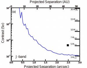
Fig. 1: An example contrast curve which pre-dates today’s paper, showing the sensitivity of an observation of the exoplanet GJ504 b (the black square). Note that closer in to the host star’s glare, the attainable contrast becomes less and less favorable for small planet masses. The fact that GJ504 b lies above the curve means that it is a solid detection. Adapted from Fig. 6 of Kuzuhara et al. 2013.
Is that blob a planet?
With no adaptive optics correction, the Earth’s atmosphere causes the light from the host star (that is, the point spread function, or PSF) to degenerate into a churning mess of “speckles“. Adaptive optics correction removes a lot of the atmospheric speckles, but optical imperfections from the instrument can leave speckles of their own. These quasi-static speckles are quite pernicious because they can last for minutes or hours and rotate on the sky with the host star. How do we tell if a blob is a planet or just a speckle?
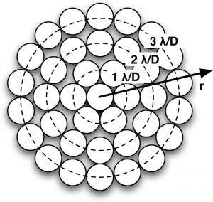
Fig. 2: As the radius from the host star decreases, there are fewer speckle-sized resolution elements for calculating the parent population at that radius. The radius intervals are spaced apart here by λ/D, the diffraction limit of the telescope. From Fig. 4 in today’s paper.
Consider the following reasoning. In the absence of a planet, the distribution of intensities on all speckle-sized resolution elements at a given radius from the host star (see Fig. 2) is a Gaussian centered at zero (Fig. 3a). I’ll set my planet detection threshold at an intensity equivalent to, say, 3σ of this Gaussian. If I actually find a blob with an amplitude greater than or equal to 3σ, then there is only a 1 in ~740 chance that the blob is just a speckle. As a trade-off, I may only recover a fraction of planets that are actually that bright (Fig. 3b).
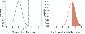
Fig. 3: Left: Pixel intensities that are just noise are distributed as a Gaussian centered around a value of zero. The vertical dashed line represents a chosen detection threshold of 3σ. The tiny sliver under the curve to the right of the dashed line represents false positive detections. Compare the shape of this curve to the blue one in Fig. 3. Right: A planet of true brightness 3σ will be detected above the threshold (orange) about 50% of the time. Fig. 2 in Jensen-Clem et al. 2018.
The name of the game is to minimize a false positive fraction (FPF) and maximize a true positive fraction (TPF). These can be calculated as integrals over the intensity spectrum of quasistatic speckles.
All well and good, if we know with certainty what the underlying speckle intensity distribution is at a given radius. (Unfortunately, for reasons of speckle physics, speckles at all radii do not come from the same parent population.) But even if the parent population is Gaussian with mean μ and standard deviation σ, we don’t magically know what μ and σ are. We can only estimate them from the limited number of samples there are at a given radius (e.g., along one of the dashed circles in Fig. 2). And at smaller radii, there are fewer and fewer samples to calculate a parent population in the first place!
The t-distribution
Enter the Student’s t-distribution, which is a kind of stand-in for Gaussians with few measured samples. This concept was published in 1908 by a chemist using the anonymous nom de plume “Student” after he developed it for the Guinness beer brewery to compare batches of beer using small numbers of samples. The t-distribution includes both the measured mean and measured standard deviation of the parent population. As the number of samples goes to infinity, the distribution turns into a Gaussian. However, small numbers of samples lead to t-distributions with tails much larger than those of a Gaussian (Fig. 3).
By integrating over this distribution, the authors calculate new FPFs. Since the tails of the t-distribution are large, the FPFs increase for a given detection threshold. The penalty is painful. Compared to “five-sigma” detections at large radii, the probability that we have been snuckered with a speckle at 2λ/D increases by factor of about 2. At 1λ/D, the penalty is a factor of 10!
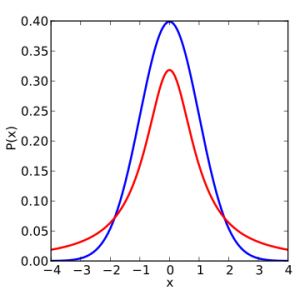
Fig. 3: A comparison between a Gaussian (blue) and a t-distribution (red). If we have set a detection threshold at, say, x=3, the area under the t-distribution curve (and thus the false detection probability) is larger than in the Gaussian case. From Wikipedia Commons.
The authors conclude that we need to increase detection thresholds at small angles to preserve confidence limits, and they offer a recipe for correcting contrast curves at small angles. But the plot gets thicker: it is known that speckle intensity distributions are actually not Gaussian, but another kind of distribution called a “modified Rician“, which has longer tails towards higher intensities. The authors run some simulations and find that the FPF gets even worse at small angles for Rician speckles than Gaussian speckles! Yikes!
The authors suggest some alternative statistical tests but leave more elaborate discussion for the future. In any case, it’s clear we can’t just build better instruments. We have to think more deeply about the data itself. In fact, why limit ourselves to one-dimensional contrast curves? There is no azimuthal information, and a lot of the fuller statistics are shrouded from view. Fear not! I invite you to tune in for a Bite next month about a possible escape route from Flatland.
Author