Today’s topic: How to create a better research poster in less time, by Mike Morrison
Posters are a huge part of academic life. At a majority of conferences, there will be a room where attendees can hang up their posters, and specific parts of the conference where researchers are encouraged to read posters and discuss them with the author.
There is one big problem with this set-up: posters are often dense and detailed, conveying important information about the study. However there are often tens – if not hundreds – of posters at major conferences and there is rarely time to read them all, much less speak to individual authors. This means that at each conference, important information is glossed over or missed completely.
Mike Morrison, a psychology PhD student, wants to make poster sessions more efficient. In his opinion, the ‘cardinal sin’ of posters is that they often require somebody to read them for 10 minutes straight, in a time-pressured environment. He identified 3 things that posters should embody, and breaks them down as follows:
- Posters should maximise the amount of insight for people attending a poster session.
- Detailed information should still be present, but not the core of the poster.
- These design goals should be easy to achieve and accessible to new and old scientists.
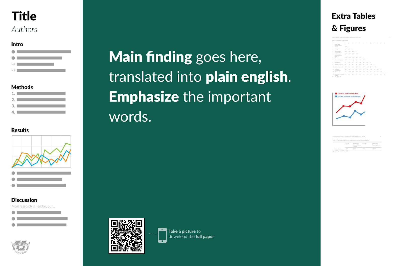
Figure 1: An illustration of the key #BetterPoster concept. Left: the ‘Silent Presenter’ bar. Center: The core message & a QR code. Right: the ‘Ammo’ bar. Notice how the core takeaway of the study is front and center, and easy to read at a quick glance.
Building a #BetterPoster
So you’re intrigued and want to try out a new poster format! In his video, Morrison breaks down the three key components of his so-called #BetterPoster, which we have broken down here.
1) The core message
Often, a study will have a single-sentence, clear takeaway. In traditional poster designs, this is commonly lost in the conclusions, and is easily missed by a conference attendee just strolling past your poster. The #BetterPoster’s biggest design change is to place your key message right in the middle of your poster, in a huge font, and in plain language.
The benefit of this approach, at expense of space on your poster, is that the takeaway of your study is easily registered, and most importantly remembered by colleagues, without them having to spend time reading the poster, or speaking to you. Make sure your description is short and punchy. If you want to test this, get somebody to walk past your screen, and see if they can gather the gist of your study from a quick glance!
2) The ‘Silent Presenter’ bar
A colleague has read your core message, and is interested in your science (and bold new poster format), so they approach to get more information. This is where you want to impart the information you would put on a typical academic poster: your introduction, methods, results, conclusions or discussion. The goal of the ‘silent presenter’ bar is to give an interested researcher the need to know information about your study, without you having to be there to explain it.
You might have less space on your silent presenter bar than you’d typically use for this purpose, because the majority of your poster is taken up by your take-home message. This is a good thing! Use these limitations to really maximise the clarity of your message. Bullet points are a good way to start, but in general, hold true to the saying: “Perfection is not when you have nothing to add, but when you have nothing to take away.”
3) The ‘Ammo’ bar
Your colleague has read your silent presenter bar, is impressed by your work, and has come to chat to you for more details. Now that you have their full attention, it is time to use the content of your ‘Ammo’ bar. This is where you put the nice to know content: extra explanations or some additional detailed results for people in your subfield, that you can point to and explain as you discuss your work with a colleague. By grouping this more complex information together, you can control how people engage with your poster: Plain-language conclusion first, bullet-point study description second, detailed science third!
Bonus Action: a QR code!
The central part of your poster might have a bit of space left. In fact, if you’ve kept your core message short and snappy, you definitely will! A good way to utilise this space is by putting in a QR code linking to your paper, a GitHub repository, or other resource connected to your work. This way, somebody that’s interested in further reading can quickly snap a picture with their phone, and look at it later!
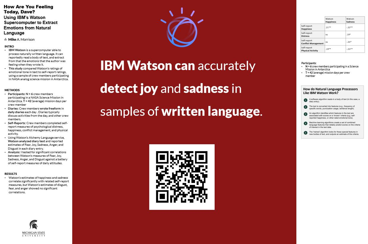
Figure 2: A simple example of a completed #BetterPoster format. As an astronomer not in this field, can you understand and remember the core message of this research without having to read the detailed descriptions?
Takeaway
The #BetterPoster rules, or Morrison’s original templates, don’t have to be followed to the letter. In Astronomy, many people have already taken on this template and tweaked it to match the specific research they’re showcasing. The important takeaway is that the #BetterPoster format should make you think about how you’re presenting information. The clearer your message, the more people will remember and engage with your research. And that’s what poster sessions are all about!
Better Posters in Astronomy + Resources
Point 3 of the #BetterPoster goals is to make sure that posters in this style are easy to create for new and old academics alike, lowering the boundary between good science and clear presentation. Mike Morrison has uploaded templates for his suggested #BetterPoster style, both in portrait and landscape. Below are also some examples of #BetterPosters from Astronomy conferences. If you’re interested, play around with the idea this conference season!
Video: How to create a better research poster in less time
Templates can be found here: https://osf.io/ef53g/
The original Twitter thread: https://twitter.com/mikemorrison/status/1110191245035479041
Influencing research: https://twitter.com/mikemorrison/status/1142143531789836288
How to make a QR code: https://twitter.com/mikemorrison/status/1126150999624888320
Check out the #BetterPoster hashtag on twitter for tons and tons of examples!
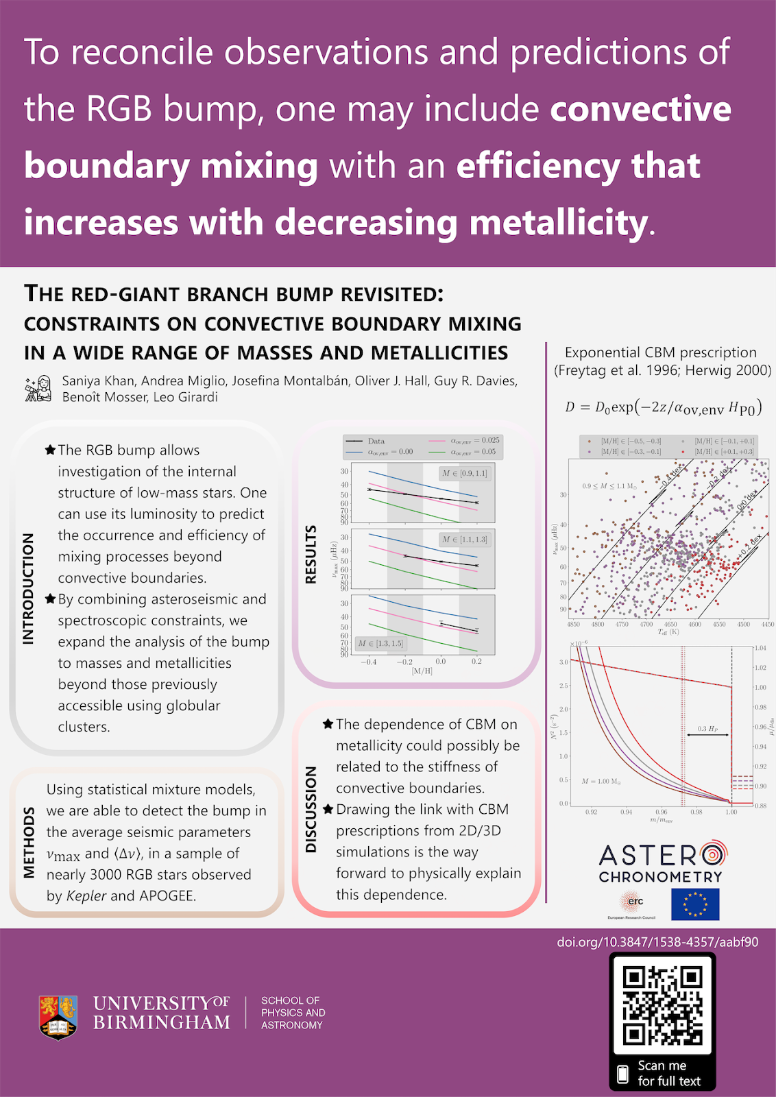
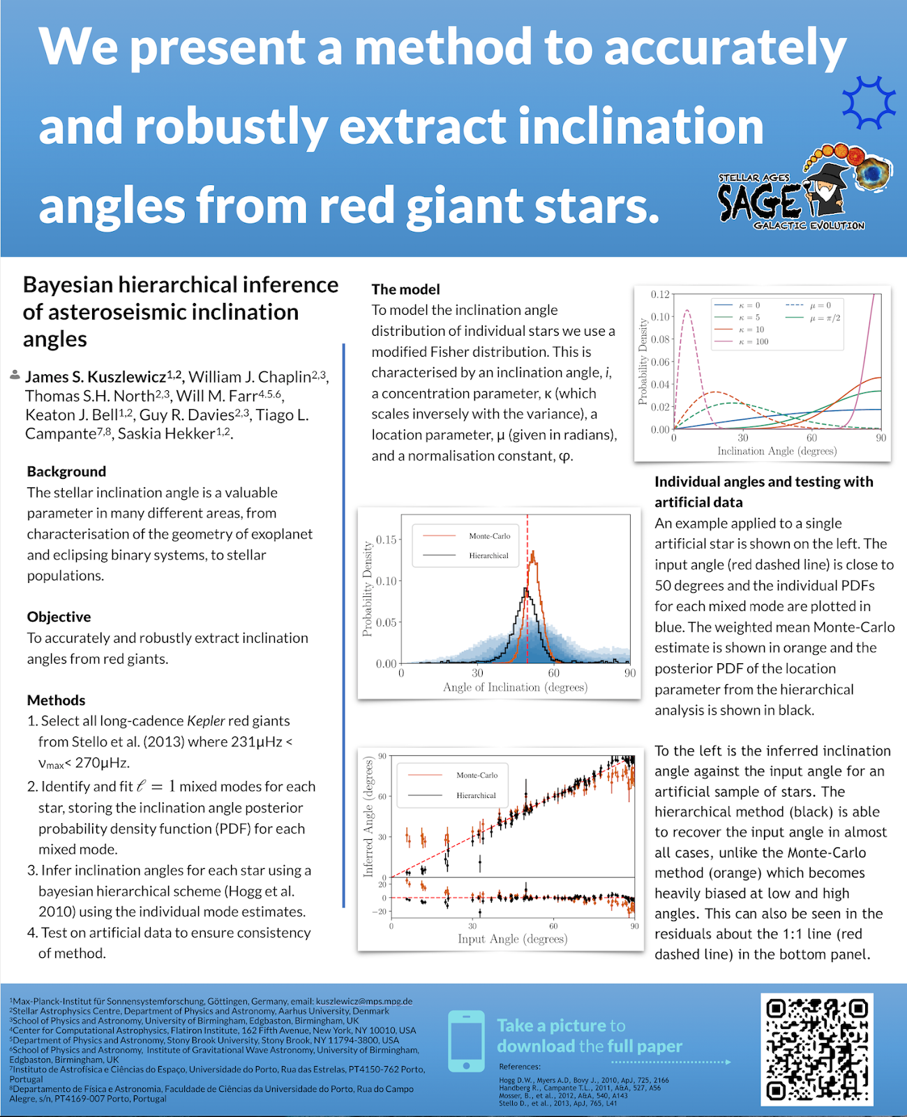
Finally, check out two #BetterPosters below, courtesy of Saniya Khan and Dr. James Kuszlewicz, who have both used the portrait format and tweaked it to their specific needs.